

I gave a talk recently about how I’ve been using data and analytics to guide my decisions in product management. I’ve edited the transcript a little and split it into bite-size parts for your entertainment. This bit is about the benefits of open and transparent data. The last bit was about how UK government digital services gather and use evidence.
The 4 main KPIs in UK Government #
The next thing is getting into the analytics used in government. Every digital service created by the UK government now has to measure at least four key performance indicators (KPIs):
- cost per transaction;
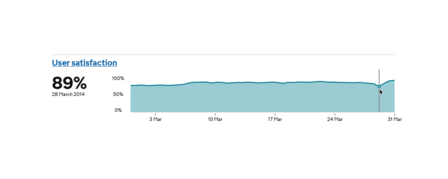
- user satisfaction rating;
- completion rate (how many people are actually able to achieve their goal or solve their problem); and
- digital take-up;
which is whether or not users are preferring to use the online web service instead of phoning up someone or filling in a paper form, because that’s really the whole point of what they’re trying to do there.
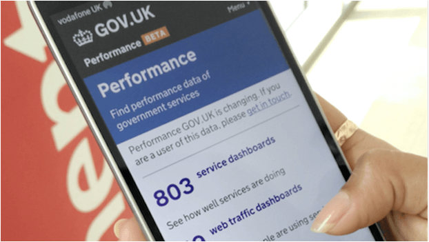
Because every service must publish this data online, completely transparently – all the dashboards I think are all at gov.uk/performance if you want to take a look – it keeps everyone honest, but also changes the conversation from blame when things are going wrong to “what can be done to improve this?”
These four main KPIs make sense for the UK government because its broader goals are to encourage people to do more interaction with government more online and to make things easier for people to do. Other organisations with different sets of goals would probably want to measure different things that were aligned with their own particular goals.
Measuring the right things #
The important thing here is that, in the context of the organisation we’re talking about, we’re measuring the right things.
We’re only really measuring things that would prompt us to take action if we saw the metrics going in the wrong way. If (for example) we saw a low completion rate, we could do some funnel analysis to see where people are dropping out, then run some experiments or user interviews to delve a bit deeper.
We really want to have this marriage of quantitative data and qualitative data, the quantitative tells us what is happening, the qualitative tells us why it’s happening. So when you’re seeing these patterns in your quantitative data, your web analytics or your other sources of data, and something looks a bit weird or piques your interest in some way, your first question should always be “why is that happening?” and your second question should be, “how can I test that to find out what’s going on?”.
Vanity metrics are pointless #
Measuring vanity metrics like page views is basically pointless – they could go up or down for a variety of reasons completely outside of your control. Your page views might go up because an email campaign has just gone out, or perhaps because a search engine is indexing your site.
So the important thing here is that we’re measuring outcomes, not outputs.
We don’t really care how many people visited the driving licence website, we’re far more bothered about whether the visitors, the users, got what they came for.
Whether they succeeded in getting their licence first time of asking, or whether they were able to update their photo on their licence, or even just find some particular information. Did they get what they came for?
We’re really bothered about whether they succeeded in what they were trying to achieve and how easily they did it.
Measure your user outcomes #
So your next takeaway is that you need to focus on measuring your user outcomes – what it is the users are actually trying to do, and what matters to them – not necessarily the outputs like page views or widgets created that tend to matter to senior management.