74: The black art of content design
I’m writing about 100 things I’ve learned the hard way about product management. You can catch up on the previous entries if you like.
While distracting myself from doing real work this week, I learnt the phrase ‘black art’ comes from the world of printing presses. So I delved deeper into the world of content design. Eventually I found a product management angle.
In this article #
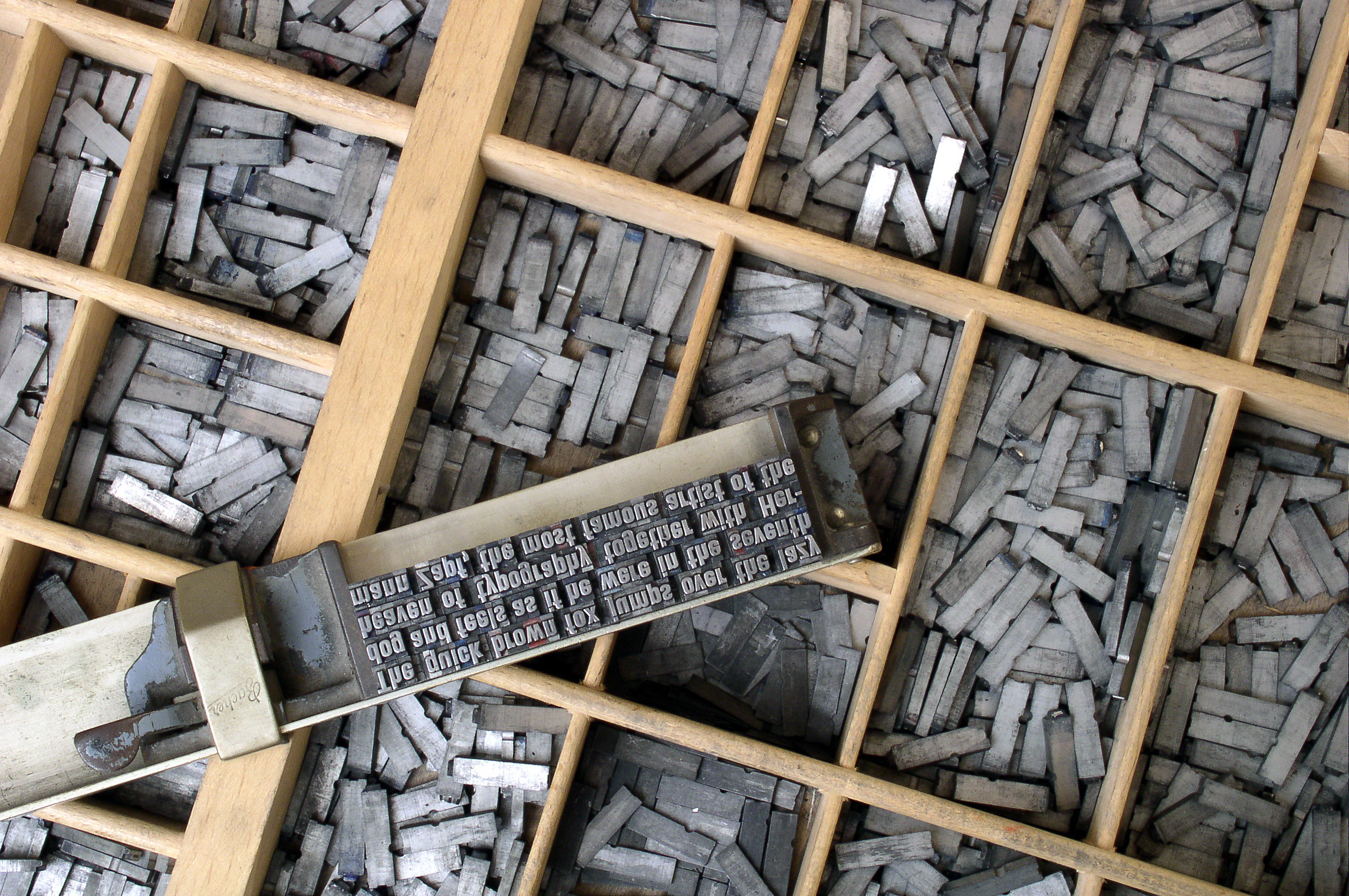
Typesetters would set individual metal letters (‘sorts’) into racks. These were then used to print pages of books and newspapers in black printer’s ink (hence ‘black art’). A typesetter would finesse the spacing between individual letters and words to make them appear attractive and easy to read. That is a black art indeed.
What’s distracting me this week
I discovered this while attempting to get to grips with a more modern form of typesetting – desktop publishing. I have vague aspirations to write, design and print my own books. Thankfully I have neither the time nor space to build a physical printing press.
Ever the procrastinator, I’ve been avoiding writing any actual content. So this week I have spent longer than I should getting to grips with Scribus. It’s a free and open source alternative to desktop publishing software such as Adobe InDesign or Lucidpress. And boy is there a steep learning curve. Worth persevering with, mind you.
This brought me to my next diversion, the typefaces themselves.
The art of typography
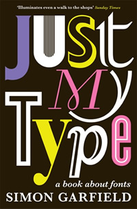
Typefaces are beautiful things, often with a rich and interesting history. An engaging book that tells these stories is Just My Type by Simon Garfield. The font face we use in our memes, blogs or printed materials does not only spell out the words for us, it conveys the tone of what we’re trying to say. If you’re not sure what I mean, try changing the default font on all your business emails to Comic Sans for a week and see what happens.
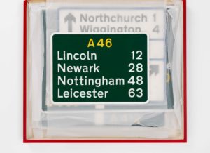
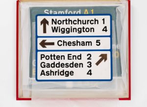
Your choice of typography also determines the legibility of what you’re trying to say. Even before people start to think about the meaning of your words of wisdom, they have to be able to read them. It’s worth considering this when you’re weighing up that funky new font for your corporate website. But imagine the responsibility of having to design a typeface that conveyed vital safety information. One that people could read easily while passing it at 50 miles per hour. In fog.

Rather comically, several volunteer airmen from Benton airport in Oxfordshire found themselves seated on a tiered platform, in the middle of the airfield, while a car drove towards them with alternate combinations of signs mounted on the roof.
“Battle of the Serif”, Margaret Calvert, London, 2006
Reproduced on www.newtransport.co.uk
First published in AGI: Graphic Design since 1950.
Published by Thames & Hudson, 2007

This was a story from the creation of the Transport typeface. Margaret Calvert and Richard “Jock” Kinneir designed Transport in the 1960s for all the signage for the UK’s emerging motorway network. Until then, there had been no unifying design system for road signage. To the confusion of motorists at the time, British road signs each bore different symbols, colours and typefaces.
By approaching the problem from an information design perspective, Kinneir and Calvert set about developing a coherent system which would be as easy to read – and understand – as possible. Kinneir said that he started with the question: “What do I want to know, trying to read a sign at speed” “Style never came into it,” recalled Calvert. “You were driving towards the absolute essence. How could we reduce the appearance to make the maximum sense and minimum cost.”
Profile: Jock Kinneir and Margaret Calvert
The Design Museum
Same challenge, different circumstances
In the 1960s there was no unifying system of information design for road signs. Before 2011, almost every UK government website looked different – and there were hundreds of them. Each one used different layouts, colours, typefaces and publishing systems. The result was a confusing and frustrating experience for people trying to access government services.
UK’s Government Digital Service (GDS) had the herculean task of consolidating all this content. It remains one of their most impressive achievements to-date. They brought together all these distinct websites into a single information design system. They achieved consistency without enforcing uniformity.
This was most certainly not a copy-and-paste job. Starting in 2011, they scrutinised, restructured and rewrote every single page in plain English. They removed the jargon and meaningless language beloved by bureaucrats so that anyone could understand it.
GDS commissioned a new typeface for online content in 2012, called New Transport. It was a modern update of Calvert and Kinneir’s original Transport typeface. They did this partly to signal the consistency of the updated content. The main reason was to take a font originally designed to be legible on road signs and make it easier to read online. You can see this in use on most UK government websites.
Never standing still
Content design is the approach of crafting visual and verbal content to meet user needs. Thankfully it has not remained a specialist discipline only used by GDS. It has been shared and taught across government.
GDS’s content design system didn’t spring into existence fully-formed. It started small to meet its immediate need. It then grew and adapted to cope with more reader and content publisher needs as they came up. It continues to evolve and improve through peer contribution and transparent working practises. Like most of UK government’s output these days, GDS maintains the design system itself in a public Github repository.
If you look at GDS’s content design system today, it is impressive in its level of detail. But what you’re seeing is the result of 8-plus years of iterative improvement based on continuous user research. When they started out in 2011, GDS’s designers may not have had all the answers, but they did have a north star to guide them. Ben Terrett, head of design for GDS in 2012 wrote this:
The design challenge here seems to be – don’t avoid the obvious. Government websites are needs driven and what people want to do is get in, get what they want and then get out. Quickly.
What we’ll be doing for the beta of GOV.UK won’t be finished. The design will be in beta as much as the rest of the site. We won’t get it right first time round. We’ll be putting stakes in the ground. Sketching out ideas we think might work, testing different solutions and setting a course for where we want this thing to head. It’s a huge, complicated task.
Ben Terrett on designing GOV.UK
Final thoughts
What we consider a black art is simply the end result of having a solid understanding of fundamental user needs, and many years of hard graft: experimentation, innovation and good user research.
Get into the right mindset now. Several years down the line, people like me will be writing about how you rose to meet the challenge, and how your work has stood the test of time. That would be nice, wouldn’t it?
Read more from Jock

The Practitioner's Guide To Product Management
by Jock Busuttil
“I wish this book was published when I started out in product management. It gives a really wonderful overview of what product management is and involves on a day to day basis.”
— Keji Adedeji, product leader & coach
Jock Busuttil is a product management and leadership coach, product leader and author. He has spent over two decades working with technology companies to improve their product management practices, from startups to multinationals. In 2012 Jock founded Product People Limited, which provides product management consultancy, coaching and training. Its clients include BBC, University of Cambridge, Ometria, Prolific and the UK’s Ministry of Justice and Government Digital Service (GDS). Jock holds a master’s degree in Classics from the University of Cambridge. He is the author of the popular book The Practitioner’s Guide To Product Management, which was published in January 2015 by Grand Central Publishing in the US and Piatkus in the UK. He writes the blog I Manage Products and weekly product management newsletter PRODUCTHEAD. You can find him on Mastodon, X (formerly Twitter) and LinkedIn.