PRODUCTHEAD: The hidden patterns within design systems
PRODUCTHEAD is a regular newsletter of product management goodness,
curated by Jock Busuttil.
okr computer
tl;dr
Federation squares the circle of having both a cohesive design system and autonomous product teams
A successful design system closely meets the needs of developers of apps and the end-users of those apps
For a design system to appeal to third parties, it has to accommodate their brand identity and niche audience needs
a favour: please share this with other product people
every PRODUCTHEAD edition is online for you to refer back to
hello
Therese Fessenden from Nielsen Norman Group describes a design system as “a set of standards to manage design at scale by reducing redundancy while creating a shared language and visual consistency across different pages and channels.”
In other words, a design system provides teams with a set of tried and tested building blocks for the user interface (UI). The goals are to provide a consistent and coherent user experience across multiple products, and to save the product teams from having to continually reinvent the wheel.
But how can an organisation reconcile the seeming conflict between having a single design system used by all its product teams, and the desire for its product teams to be truly autonomous? Can design scale? (Spoiler alert: yes, but it takes effort.)
It’s instructive to review how the use of a design system has evolved in larger organisations. After all, the more autonomous teams there are, the harder it is to achieve alignment in design.
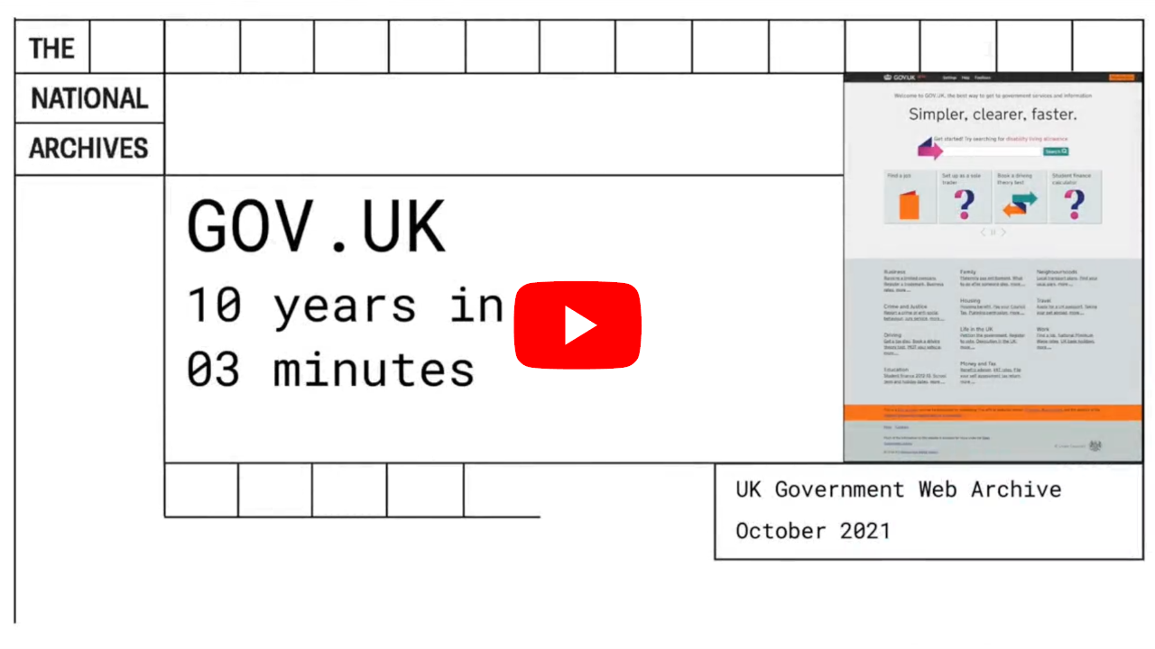
GOV.UK Design System #
The first example I’d like to share with you is the design system in use in UK government. It has evolved a great deal over the last decade, but notably got through most of the big visual changes relatively early on, as this video illustrates.
Much of the change hiding behind the scenes centred instead on how the elements worked for users, rather than how they looked, and on how to make the design system easier for developers to adopt across the public sector.
I find the pattern of its adoption particularly interesting given the federated nature of the various departments and agencies in central government (each a large organisation with their own autonomous delivery teams), then subsequently beyond central to local government, and to other public sector bodies such as the UK’s NHS (National Health Service).
It’s hard enough encouraging teams within the same organisation to adopt the same design system; it’s an order of magnitude harder when those teams are themselves working in separate, independent organisations.
Part of the key to its widespread adoption, I think, has been finding that tricky balance between visual and functional coherence, and having the flexibility for individual organisations to adapt the designs for their own specific needs and use cases. To explore this a little further, I’ve also provided a couple of case studies from the Ministry of Justice and the NHS.
Material Design #
The second example is the Material Design system that Google has been converging towards over the last decade.
Early on in 2013, Google’s desire for a coherent design systems could be seen as a reaction to several factors:
- tackling the fragmentation in UI design for which Google had been notorious;
- moving away from a culture of big data driving design decisions (exemplified by the oft-cited A/B testing of 41 shades of blue for links) to a culture of humans designing for humans;
- creating a single, responsive design adaptable to both large and small screens; and
- finding a visual language that hit the sweet spot (in 2013) between Apple’s skeuomorphism (digital interfaces that look like their real-world analogues) and Microsoft’s uncompromisingly flat Metro design.
The evolution started with cards as a unifying design element, simple enough to convey information to users effectively and without additional clicks, and versatile enough for various teams to adopt without feeling overly constrained. Soon after, the next step was Quantum Paper, the codename for what would become Material Design.
Quantum Paper started to bring together both consistent design elements across Android, iOS and the web, and introduced an implementation framework called Polymer to encourage developer adoption. Rather than this being a design system for Google only, everyone was encouraged to use Material.
But with mass adoption came a new problem: everything started to look the same. How could developers in companies outside of Google create a Material app for Android while still retaining their own brand’s distinctiveness? The answer was Material Theming, “a design system for design systems,” as Google’s VP of design Matias Duarte described it. Variations on the theme could be created simply with tabs and sliders. Duarte wanted apps to work the same to make it easier for users, but not necessarily to look uniform.
Similar patterns of evolution #
What both these examples of design systems broadly have in common are the stages they’ve gone through:
- A relatively rapid evolution of a desirable and effective visual language to a relatively stable state
- Treating the design system as a product in its own right, taking into account the needs of its two main groups of users: creators (developers) and consumers (end-users of the resulting app)
- A focus on making the design system itself more easily adopted by developers, and on improving the usability for end-users, while the visual language changes minimally
- Making it easier for third parties to customise the visual language for their own brand without sacrificing the usability and coherence of the components for end-users
- Elaborating the design system to provide developers with bigger building blocks tackling common design patterns
What makes a successful design system #
What is also clear is that, for a design system to be successful in an ecosystem of organisations (or even just one large organisation), it needs to be treated as a product in its own right. It’s not simply a prescribed collection of colours, typefaces and icons.
A design system requires a sound underlying premise. It’s there to solve a problem beyond the obvious goal of UI consistency. For GOV.UK it was ‘simpler, clearer, faster.’ For Google, ‘designing for the materials of the future, instead of the materials of today.’
A design system also needs a team dedicated to researching, iterating and improving it for both developers creating apps with it, and the people who then use those apps. It’s an ongoing commitment, years in the making, not a one-off project.
Speak to you soon,
Jock
what to think about this week
Introducing the GOV.UK Design System
We’ve developed the Design System by working with teams across government. We’ve also been building a cross-government community of Design System users and contributors who will help to maintain and develop it.
[ALICE NOAKES & AMY HUPE / GOVERNMENT DIGITAL SERVICE]
Going beyond the GOV.UK Design System for MoJ Forms professional users
The GOV.UK Design System is fantastic. But as most of its components and patterns are made for public-facing services, they focus on simplicity and effectiveness – so that anyone can use them – over efficiency – how fast they are to use.
MoJ Forms target users are different: they are professionals, likely to be more digital savvy and they will use our product more frequently as part of their jobs.
Different needs for a niche audience
[FABIEN MARRY / MINISTRY OF JUSTICE DIGITAL & TECH]
Adapting the GOV.UK Design System for the NHS
People’s relationship with and perception of the NHS is very different to that of government.
Our GDS colleagues understood our reasoning for diverging from the GOV.UK Design System, and helped us figure out the best way to retain links with its foundations, without being bound to it.
A head start in design practice and stakeholder approval
[TIM PAUL & DEAN VIPOND / NHS DIGITAL]
Team models for scaling a design system
Overlords don’t scale. Instead, large organizations now embrace digital design at the scale of hundreds of designers working on countless products across web/native app, desktop/handset, internal/customer-facing, and other dimensions.
Modern design organizations are making their way from solitary teams making a library available or a centralized team serving disconnected products towards a more federated approach.
Solitary, centralised and federated
[NATHAN CURTIS / MEDIUM]
Redesigning Google: how Larry Page engineered a beautiful revolution
Something strange and remarkable started happening at Google immediately after Larry Page took full control as CEO in 2011: it started designing good-looking apps.
We went to Google looking for the person responsible for the new design direction, but the strange answer we got is that such a person doesn’t exist. Instead, thanks to a vision laid out by a small team of Google designers, each product team is finding its way to a consistent and forward-looking design language thanks to a surprising process.
They’re talking to each other.
What might a cohesive vision for Google look like?
[DIETER BOHN & ELLIS HAMBURGER / THE VERGE]
Google’s Material Design: A design system with mass adoption
The debut of Material at Google I/O 2014 indicated that not only did Google want to create consistency across all Android design and devices, but the simultaneous release of APIs proved Google’s interest in inviting third-party developers to participate in their new design system as well. This lead to mass adoption of Material and acted as the jumping-off point for the creation of hundreds of other design systems.
The good-looking child of flat design and skeuomorphism
[DESIGN SYSTEMS / FIGMA]
recent posts
Whatever this is, this web3 product manager role is not a product manager
Jason Shah wrote a guest post recently for Lenny Rachitsky’s newsletter, “A Product Manager’s Guide to web3”, which describes how product management differs in web3 companies. He notes that joining a web3 company can be “an opaque process and a risky decision”. I’d add “ethically challenging and morally grey” to that description.
“You keep using that word. I do not think it means what you think it means.”
[I MANAGE PRODUCTS]
Sorting the signal from the noise — a guide to fact-checking
One of the most important, and arguably hardest jobs we have as product managers is to work with our team to sift through information, read between the lines, and verify what is fact and what is merely opinion.
[I MANAGE PRODUCTS]
upcoming talks and events
I’ve spoken at various product management and technology conferences around the world and online. I share ideas primarily on the topic of product management, and this tends to overlap with agile and ethical product development, leadership and strategy, and fostering healthy product cultures and communities.
“Day 2 saw an impressive presentation by Jock Busuttil on user testing. He asked the attendees to lend each other a smartphone and take a picture. What a turmoil that caused ;-) ”

Walter Schärer
Marketing & Business Development Director, BlueGlass Interactive
If you’d like to book me to speak at your event, please get in touch.
can we help you?
Product People is a product management services company. We can help you through consultancy, training and coaching. Just contact us if you need our help!
Helping people build better products, more successfully, since 2012.
PRODUCTHEAD is a newsletter for product people of all varieties, and is lovingly crafted from an arts & crafts desk in need of restoration.
Read more from Jock

The Practitioner's Guide To Product Management
by Jock Busuttil
“I wish this book was published when I started out in product management. It gives a really wonderful overview of what product management is and involves on a day to day basis.”
— Keji Adedeji, product leader & coach
Jock Busuttil is a product management and leadership coach, product leader and author. He has spent over two decades working with technology companies to improve their product management practices, from startups to multinationals. In 2012 Jock founded Product People Limited, which provides product management consultancy, coaching and training. Its clients include BBC, University of Cambridge, Ometria, Prolific and the UK’s Ministry of Justice and Government Digital Service (GDS). Jock holds a master’s degree in Classics from the University of Cambridge. He is the author of the popular book The Practitioner’s Guide To Product Management, which was published in January 2015 by Grand Central Publishing in the US and Piatkus in the UK. He writes the blog I Manage Products and weekly product management newsletter PRODUCTHEAD. You can find him on Mastodon, X (formerly Twitter) and LinkedIn.